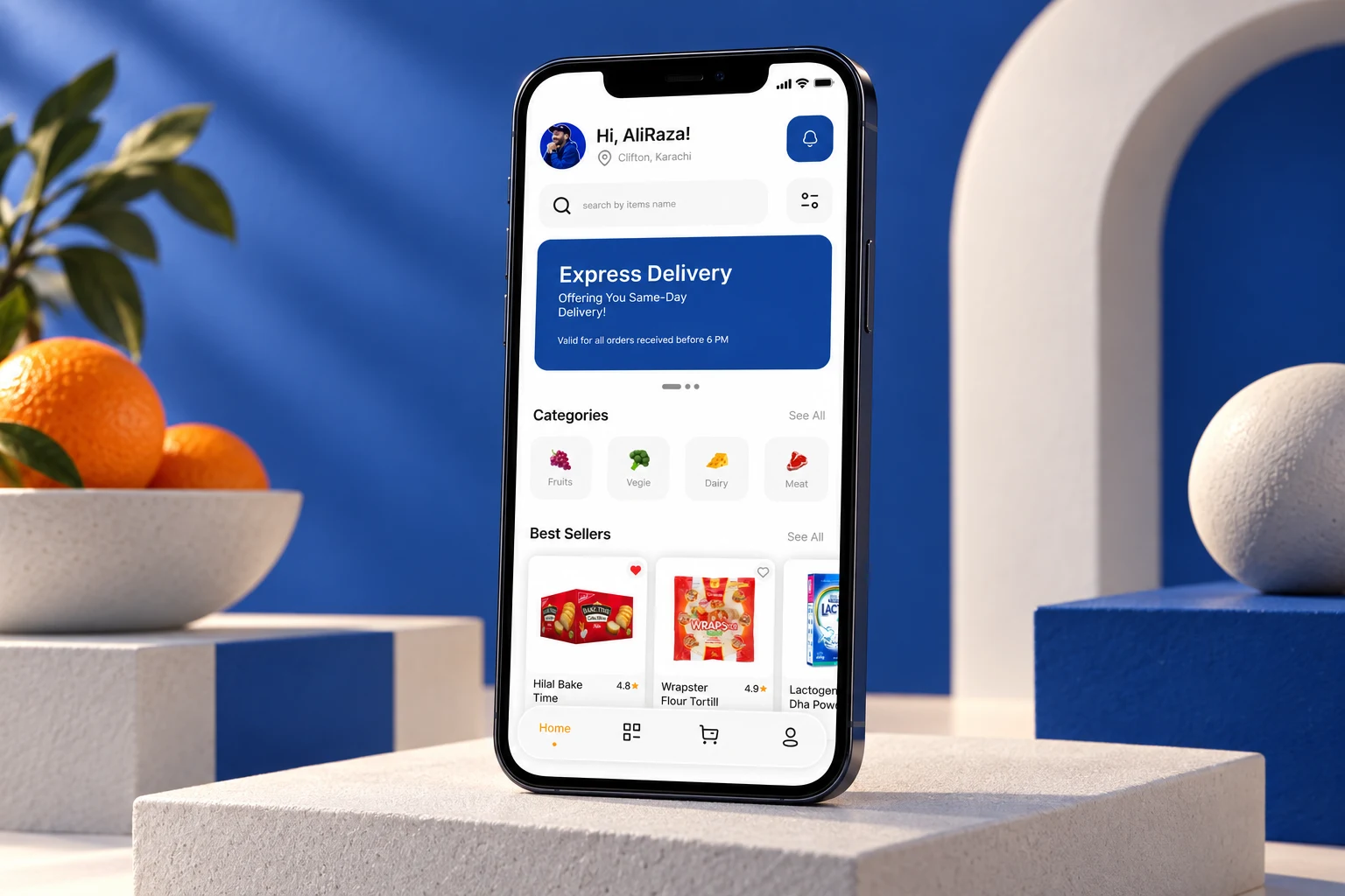
From a folder of work to a clear story.
Portfolio Presentation / Design notes From a folder of work to a clear story. Good presentation makes the thinking and the craft easier to see.
Design insights / Notes from the practice
Thoughts on ideas, visual systems and the craft of making them real.

Portfolio Presentation / Design notes From a folder of work to a clear story. Good presentation makes the thinking and the craft easier to see.

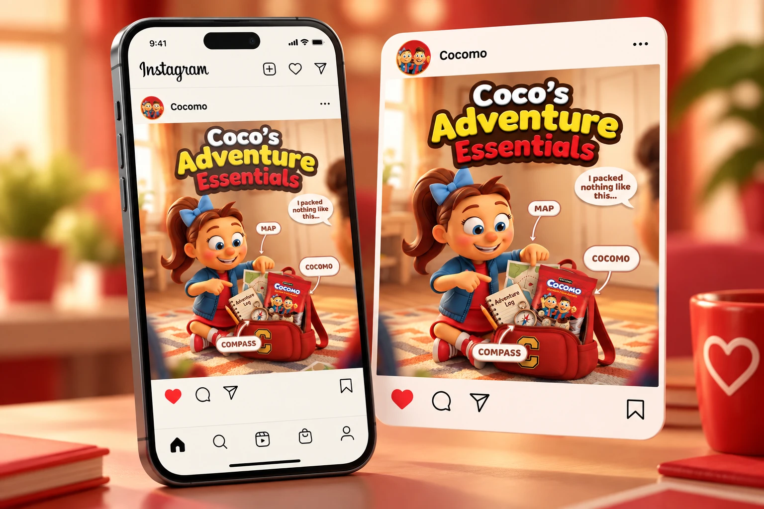
Social Media Design / Design notes Design the series, not just the post. Individual ideas become more memorable when they share a visual language. Give
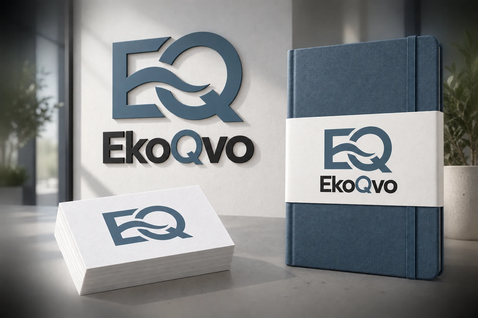
Brand Identity / Design notes A brand is more than its logo. The mark starts the conversation. The system keeps it consistent. Start with where
A closer look
These notes look at the choices behind the finished image: how a brand identity stays consistent, how individual campaign posts connect and how a collection of files becomes an understandable portfolio. The aim is to give you practical ways to look at visual work, whether you are planning a brief, reviewing a design or presenting a project of your own.
A logo can introduce a brand, but the surrounding system carries it across different settings. Read Beyond the logo for a closer look at colour, typography, hierarchy and applications. These decisions help a small social asset, a business card and a larger campaign feel related without becoming identical.
A strong individual post should also make sense beside the rest of a series. Design the series explores a shared visual language, the role of variation and the practical demands of different formats. It is a useful starting point when your brief includes multiple messages, products or publishing moments.
The way work is organised affects how easily someone can understand it. From files to story looks at selection, sequencing and showing enough detail to make the craft visible. For examples, browse the portfolio alongside these design insights. If you want to apply similar thinking to your own brand, explore the services or start a conversation. More notes can be added here as the practice develops.
The articles are written for people who need to make or review creative work: independent designers, brand owners and collaborators putting a brief together. You do not need specialist terminology to use them. Each guide focuses on decisions you can recognise in a real project, from the order of information on a screen to the relationship between a logo and its applications.
Read an article, then look at a relevant project and ask how the principle appears in the work. Does the hierarchy make the message easy to scan? Do the images feel connected? Does the presentation explain enough without becoming repetitive? These questions make design insights more useful than a checklist applied without considering the context.
The current collection covers identity, social campaigns and portfolio presentation. Together they move from building a visual language to using it across individual pieces and finally presenting the result. Start with the topic closest to your immediate task. You can return to the other guides when you need to connect that task to a larger body of work.
Readable text and useful image descriptions make visual work easier to understand. Where relevant, the articles link to guidance from the W3C Web Accessibility Initiative. These references are a starting point for checking decisions in context, not a substitute for reviewing a complete design with the people who will use it. Practical design insights should lead to clearer communication for the audience as well as a stronger visual result.
Your next idea starts here