Social Media Design / Design notes
Design the series, not just the post.
Individual ideas become more memorable when they share a visual language.
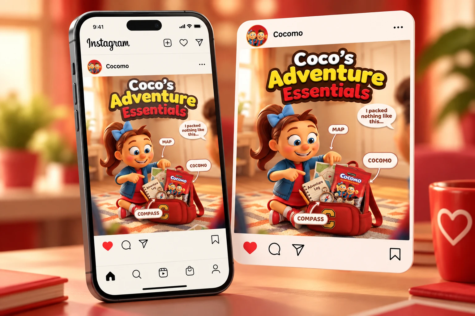
Give each visual one job
An introduction, an offer and a useful tip do not need the same hierarchy. Decide what the viewer should notice first, then let the other details support it.
Connect without repeating
A controlled palette and repeatable type hierarchy can hold a series together. Let composition change so each design still has its own energy.
Review at the size people see
Check the set on a phone. Look for small text, competing focal points and near-identical layouts. Edit the collection before judging every post in isolation.
A closer look
Start with the whole series
01 The overview
Social media design becomes more coherent when the individual posts are planned together. List the messages you need to communicate and the action each post should encourage. One asset might introduce a product, another explain a feature and another answer a common question. Thinking about that sequence helps avoid a feed full of unrelated ideas competing for the same attention.
02 1. Define a repeatable visual language
Choose the elements that should remain recognisable: a headline treatment, brand colours, image framing or a small recurring graphic device. Keep the system simple enough to use across different messages. You are building a relationship between posts, not a rule that every post must have identical proportions. A useful system gives you a starting point while leaving space for the subject.
03 2. Give every post one clear priority
A single asset cannot explain everything about a brand. Decide what the main takeaway is and make it easy to find. Supporting details should follow that message in a readable order. If a short caption or a linked page can carry the additional information, the visual may be stronger with fewer words. Test the design on a phone rather than judging it only on a large monitor.
04 3. Use variation with a purpose
Alternate product-focused imagery, expressive typography and quieter explanatory layouts when the campaign needs them. The repeated visual elements keep the series connected while the variations help each message feel intentional. In social media design, consistency works best when it supports the content rather than forcing every idea into an unsuitable template.
05 4. Adapt the composition to the format
A portrait post, a square image and a story have different usable spaces. Recompose the hierarchy instead of simply cropping the same artwork. Keep essential information away from edges and areas where interface controls can appear. Check the current requirements of the platform when exporting, because placements and display treatments can change. For accessible digital text, use the W3C contrast guidance as a reference.
06 5. Review the campaign as a collection
Place the assets next to each other and look for unnecessary repetition, inconsistent spacing and changes in tone. Then inspect them individually at their intended size. Check spelling, product details and calls to action before export. A final review of both the series and its parts catches problems that are easy to miss when working on one artboard at a time.
07 Turn the system into a useful handover
Agree which editable files, exports and usage notes are needed. A small set of clear examples can make future updates easier without creating an overcomplicated manual. Browse my social and campaign work to see connected collections, or read about the identity system behind a brand. If you need social media design for a new campaign, share the audience, messages and required formats so the scope can be built around them.
Your next idea starts here