Portfolio Presentation / Design notes
From a folder of work to a clear story.
Good presentation makes the thinking and the craft easier to see.
Group by the idea
Related logos, layouts and motion pieces may belong to one project even when their formats differ. Give them a shared context. Keep unrelated studies separate.
Make every frame useful
Lead with a strong cover, then show details that add information: a layout, a system, an application or a screen flow. Avoid filling a gallery with nearly identical exports.
Keep the context honest
Name the scope and explain observable design choices. Include client history, process and results only when they are known. A clear presentation does not need invented success metrics.
A closer look
Begin with the reader
01 The overview
A portfolio presentation should help someone understand the work without needing you to explain every image beside them. Think about who will read it and what they need to know. A potential client may want to understand your visual approach and the kinds of deliverables you create. Another designer may look more closely at the construction, systems and process behind the finished piece.
02 1. Select work with a clear role
Start by grouping related files, then identify the strongest example of each important idea. Repetition can make a presentation feel longer without adding understanding. Keep alternate versions when they explain a decision or demonstrate useful flexibility. A small logo assignment can be a focused project; it does not need to imitate the length of a full campaign case study.
03 2. Describe what the project actually contains
Explain the type of work, your role and the material available to show. Separate original artwork from presentation mockups and label personal concepts or creative explorations clearly. Avoid claiming commercial results, research findings or client relationships that the project does not establish. A precise description builds a more trustworthy portfolio presentation than a large claim with no supporting evidence.
04 3. Give the images a sequence
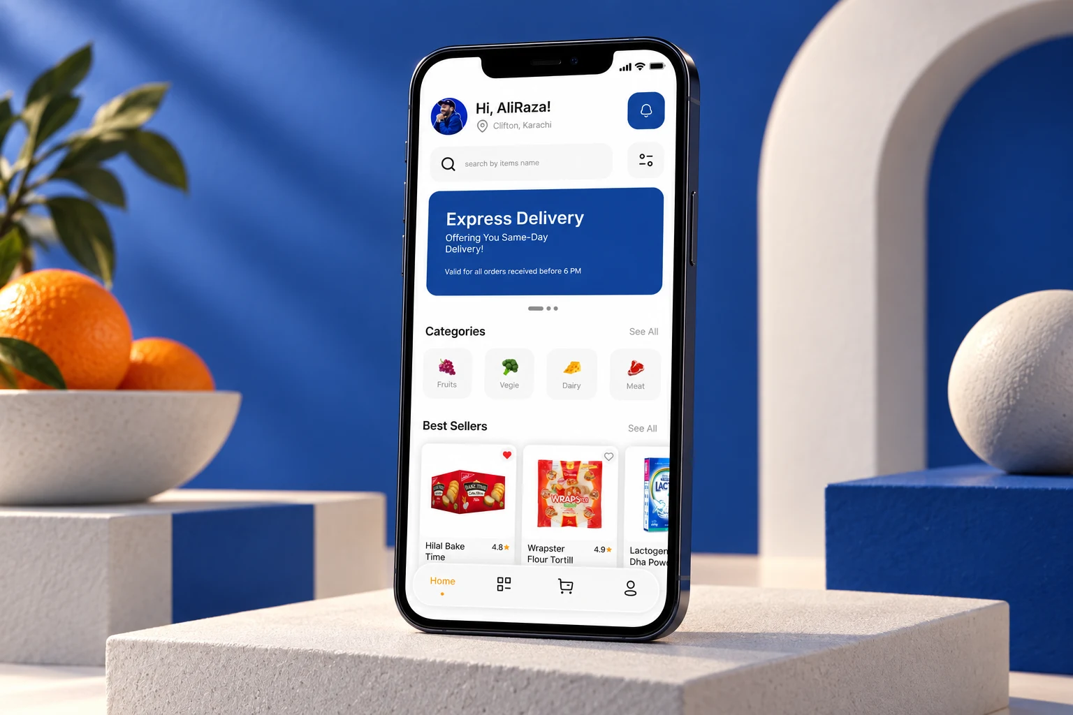
Open with a strong overview, then move into the details that explain the work. An identity project might show its mark, alternate arrangements and applications. A mobile interface study might move from a key screen into a connected journey. The order should help the viewer understand relationships rather than simply reproduce the order of files in a folder.
05 4. Show both context and detail
Mockups can explain scale and setting, while flat artwork makes the design easier to inspect. Use both when they contribute something different. Avoid placing every image inside a device or scene if that hides the craft. For videos, choose a representative poster frame and preserve the intended proportions. For tall screens, make sure important parts can still be examined at a readable size.
06 5. Review the complete experience
Check the portfolio on a narrow screen as well as a desktop. Read the captions, follow the links and open the images. Make sure text remains legible and the page does not depend on motion to communicate essential information. The W3C image accessibility guidance is useful when writing alternatives for meaningful images and deciding which decoration can be ignored.
07 Keep the portfolio presentation focused
Finish with a relevant next step, such as a related project or a way to get in touch. Leave room for the work instead of surrounding every image with a long explanation. Explore my portfolio collection for different presentation formats, including mobile interface work and identity work. If you are planning a project, share your brief; the final presentation should grow from the actual scope and the material created.
Your next idea starts here