Brand Identity / Design notes
A brand is more than its logo.
The mark starts the conversation. The system keeps it consistent.
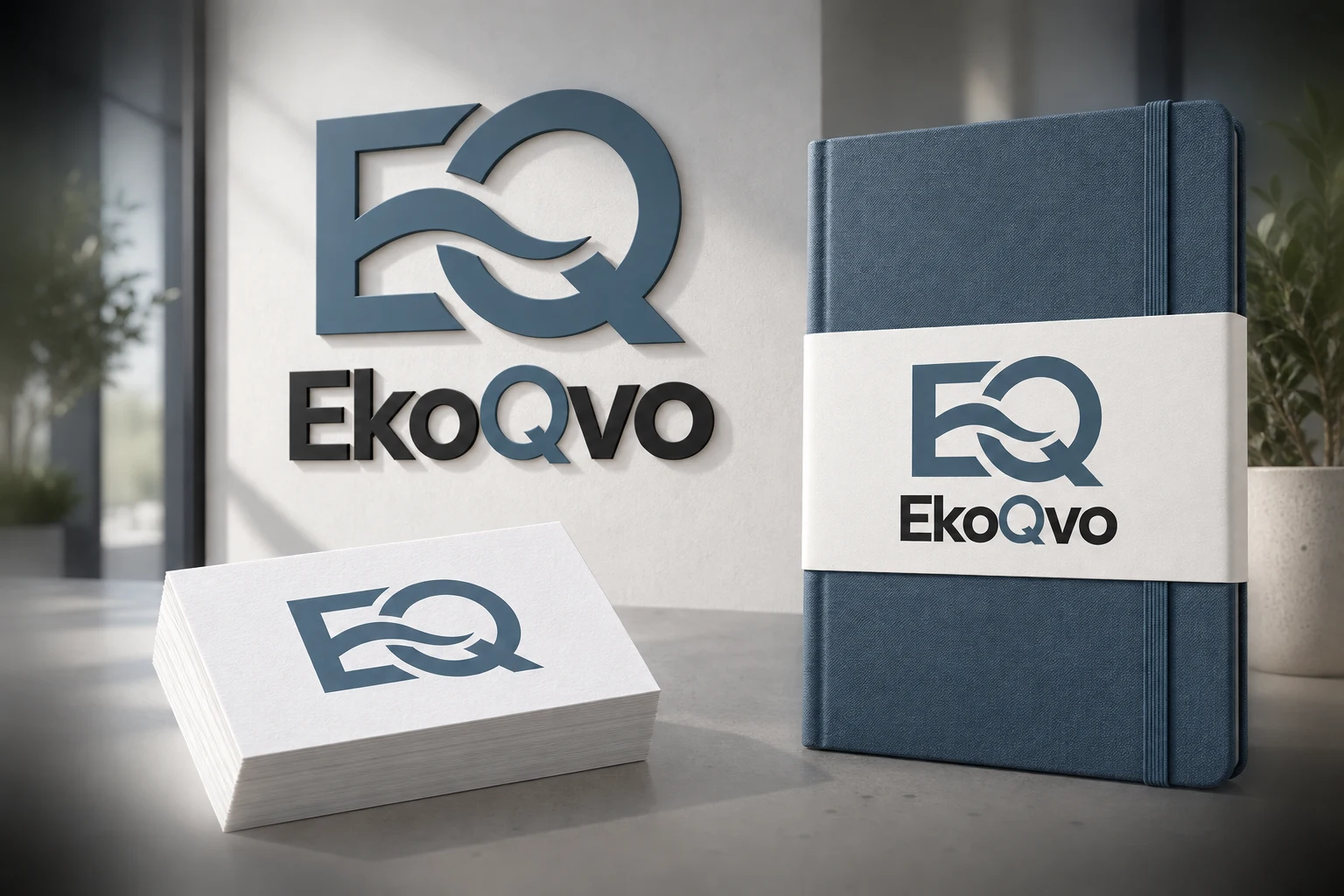
Start with where it lives
List the places people will meet the brand: a phone screen, a package, a storefront or a proposal. Each setting creates a different design problem. A useful identity has room for all of them.
Give the details a shared logic
Typography, colour, spacing and imagery should feel related without making every layout identical. Decide which elements stay consistent and which can flex.
Test it in context
A logo on a blank page tells only part of the story. Try it across a few relevant applications. Present mockups as visualisations, and keep the original artwork easy to inspect.
A closer look
Start with a clear purpose
01 The overview
Before choosing colours or collecting visual references, write down who the identity is for and what it needs to communicate. A neighbourhood food brand and a professional service may need very different kinds of recognition and reassurance. The brief should identify the audience, the main message and the places where the work will appear. Those constraints give the design a useful direction.
02 1. Colour has a job to do
A palette should do more than look attractive on one artboard. Define which colour leads, which colours support it and where a quiet neutral is useful. Then test the combination on light and dark backgrounds. Small text needs enough contrast to remain readable, especially on mobile screens. The W3C guidance on text contrast is a helpful reference when checking digital applications.
03 2. Typography connects the voice
Choose type for the actual reading tasks in the project. A striking display style can work well for a short headline but feel tiring in a paragraph. Establish a small set of roles for headings, body text and supporting information. Consistent size, spacing and weight choices make a brand identity easier to apply across assets without forcing every layout to look the same.
04 3. Hierarchy makes the message clear
Ask what someone should notice first, what they should understand next and what action they should take. Scale, spacing and contrast can create that order. If every element competes for attention, the message becomes harder to scan. Test a layout at the size where it will actually be seen; a presentation viewed full-screen can hide weaknesses that appear in a small social post.
05 4. Imagery should feel connected
Photography, illustration and graphic devices each shape the character of a brand. Decide what should stay consistent: lighting, framing, colour treatment, drawing style or the way type interacts with the image. Consistency does not mean repeating one picture. It means giving different images enough shared qualities that they belong to the same visual world.
06 5. Applications test the brand identity
Place the system into the real formats needed by the brief. A business card tests small details, a social asset tests hierarchy and a packaging panel tests information density. These applications can reveal where a logo needs an alternate arrangement or where a colour is difficult to use. Show the original artwork alongside mockups so the presentation remains useful for inspecting the actual design.
07 A practical review checklist
Review the mark at a small size, compare light and dark applications, check the type hierarchy and read every piece of essential information. Confirm which files and usage notes the project needs. You can see identity presentations in my portfolio, including The Hawaii Retreat. For a new identity brief, explore design services or contact me. The goal is a brand identity that stays recognisable while remaining flexible enough for the work ahead.
Your next idea starts here