A tightly connected symbol and wordmark, developed around a bold interlocking construction. New presentation concepts explore how the supplied logo can live beyond a flat artboard.
Scope
Logo design and presentation concepts
01 / The identity
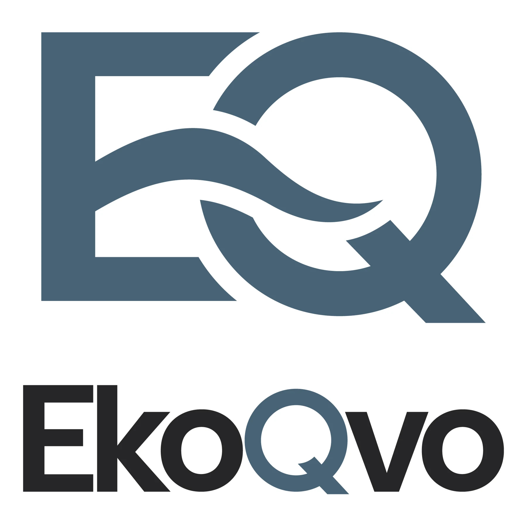
EkoQvo — A compact mark. A confident impression.
Interlocking letterforms and a flowing central shape give the monogram a distinctive silhouette. The quiet blue-grey palette keeps the presentation precise and composed.
EkoQvo Logo
02 / Visual language
Recognition through restraint.
A focused presentation built around the supplied logo: generous space, a clear contrast between symbol and name, and a consistent material palette.
Slate blue
#486577
Carbon
#202425
Cool grey
#D9E0E1
Paper
#F7F7F2
Presentation palette drawn from the supplied artwork.
01 / In context
Identity in context.
Concept applications of the original identity across materials and touchpoints.
Presentation mockups show the supplied work in context.
Original artwork
Explore the details.
Original supplied artwork. Open an image to inspect it at full size.